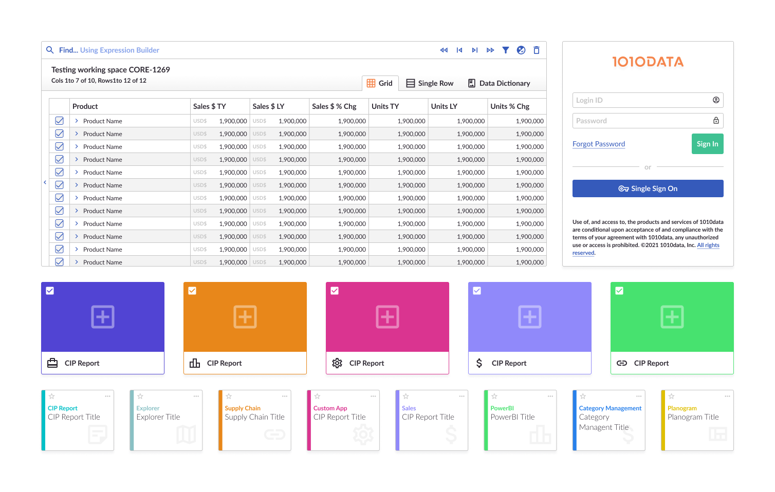
1010data offers a powerful cloud-based platform that provides big data discovery and data sharing capabilities. Serving more than a trillion rows of data to businesses worldwide, 1010data has emerged as a front-runner in providing insights from raw data more swiftly and effortlessly than any other solution in the market. Recognized for its scalability and performance, its clientele ranges from startups to Fortune 500 companies, proving its versatility and aptitude for data-driven decision-making.
Design Tools
Figma, Adobe Creative Suite, Feedback Surveys.
Dev Tools
ZeroHeight, Storybook.js
Challenge
Reflect the company's commitment to cutting-edge innovation as well as improve user experience, enhance operational efficiency, and reinforce brand identity.
Despite 1010data's outstanding technological advancements and vast clientele, the need for a streamlined, intuitive, and contemporary design system became evident. The goal was not only to reflect the company's commitment to cutting-edge innovation but also to improve user experience, enhance operational efficiency, and reinforce brand identity. This portfolio takes you through the meticulous journey of creating a new design system for 1010data, emphasizing the research, strategies, and design choices made to meet the needs of a leading big data company.
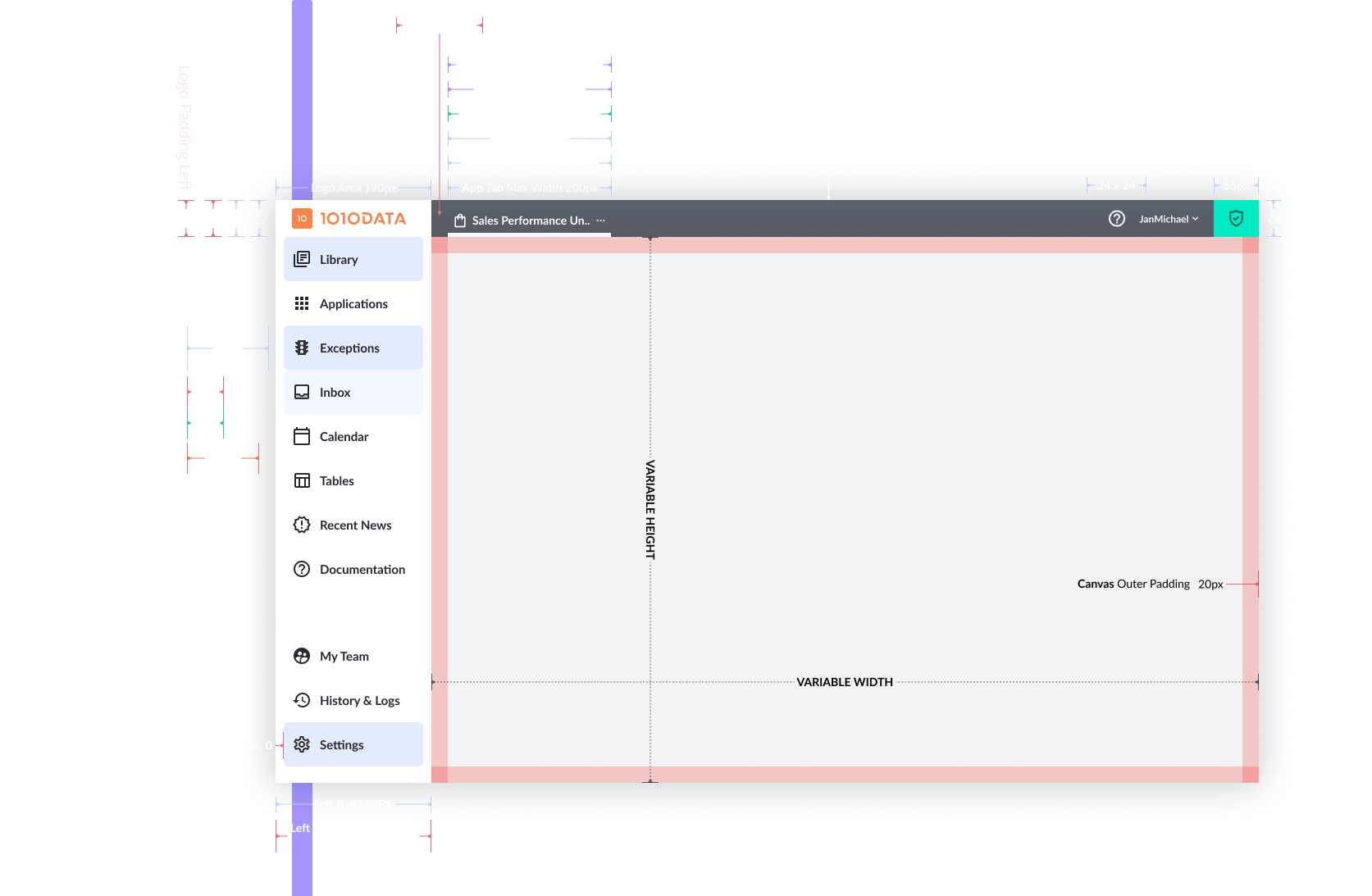
It's crucial to note that 1010data started with a clean slate concerning the design system. There was no established design system in place. This lack presented both a challenge and an opportunity. The challenge was in defining a visual and interactive language from scratch. The opportunity, however, lay in crafting a system that would be entirely tailored to 1010data’s unique needs without any inherited limitations.
Overview
To understand the core users of our system, we embarked on a comprehensive interview process. Our primary respondents included:
Category Managers in the Retail Space: These professionals have a unique set of requirements, focusing heavily on visual data representation, efficient data navigation, and user-friendly interfaces for decision-making.
Financial Analysts: Known for their precision and detail-oriented nature, financial analysts provided insights into the intricacies needed for numerical representations, the importance of error-free interactions, and the need for advanced analytical tools.
Supply Chain Managers: Efficiency and accuracy are paramount for supply chain managers. Their feedback largely revolved around real-time data representation, the necessity for intuitive workflows, and the importance of seamless integration with other supply chain tools.
These interviews became the bedrock for our design choices, ensuring that the end product would be attuned to the real-world needs and expectations of its users.
Design Frameworks & Color Palettes
Overview
In the absence of a pre-existing design system and to ensure that we remained in line with modern design standards, we turned to established design frameworks for inspiration.
These interviews became the bedrock for our design choices, ensuring that the end product would be attuned to the real-world needs and expectations of its users.
Vuetify.js: Leveraging its extensive component library and adherence to Material Design guidelines, Vuetify.js provided us with a robust starting point. It enabled us to visualize and craft interfaces that are both functional and aesthetically pleasing.
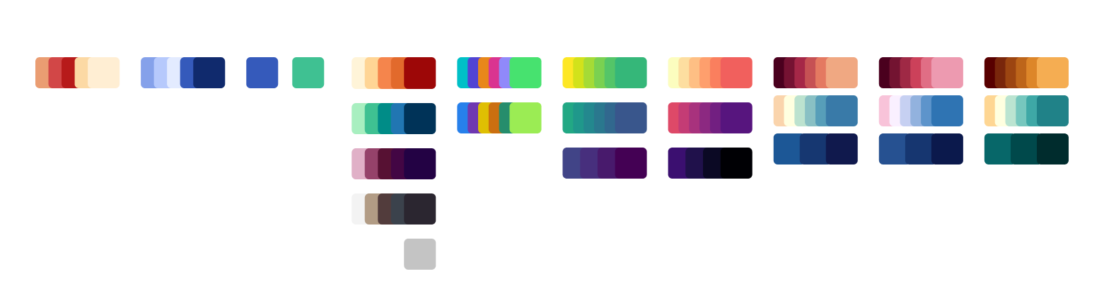
Adobe Spectrum: Recognizing the significance of color in data representation, especially in a data-intensive platform like 1010data, we adopted Adobe Spectrum's visualization color palettes. These palettes, renowned for their versatility and clarity, ensured that our visualizations remained coherent, easily interpretable, and pleasing to the eye.
By grounding our design decisions in both user-centric research and established design frameworks, we aimed to craft a system that was both innovative and tried-and-true in its effectiveness.
Overview
Each design decision we made was rooted in a set of core principles, designed to serve as a North Star for our team and ensure alignment with 1010data's overarching mission.
Clarity: At the heart of our design system lies the principle of clarity. Recognizing the complexity of big data, our primary goal was to simplify information presentation. By ensuring that every element, from typography to data visualizations, was clear and direct, we aimed to make data insights immediately apparent to users, eliminating ambiguity.
Consistency: Consistency breeds familiarity and trust. By maintaining a consistent look and feel across all interfaces and interactions, we wanted to ensure that users, whether they were financial analysts or supply chain managers, could effortlessly navigate the platform. This consistency also accelerates onboarding and reduces the learning curve.
Flexibility: Understanding that the needs of big data users are diverse and ever-evolving, our design system was crafted with adaptability in mind. This means designing components and interactions that can be scaled, customized, or reconfigured to meet varying user needs without compromising the overall user experience or system integrity.
Accessibility: Every user, regardless of their abilities, should be able to interact with and derive value from the platform. With this principle, we committed to adhering to established accessibility standards, ensuring features like contrast ratios, keyboard navigability, and screen reader compatibility were not afterthoughts but integral aspects of the design.
Data Driven Design: As a company grounded in data, it was only fitting that our design choices mirrored this commitment. We relied heavily on user feedback, analytics, and usability testing to shape our design decisions. This approach ensured that our design system was not just based on aesthetic choices or trends, but on tangible data reflecting real user needs and preferences.
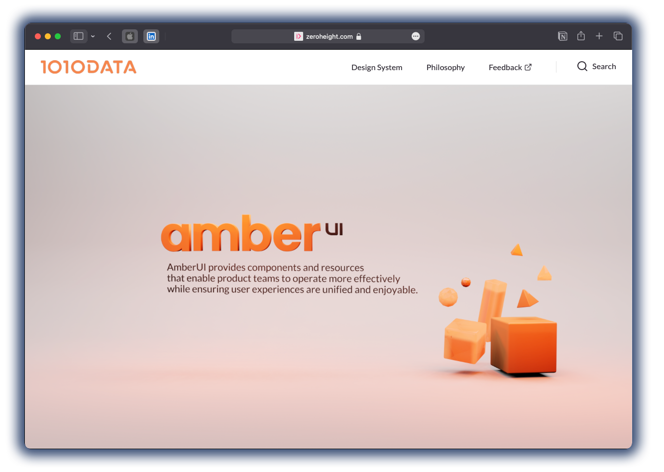
Amber UI's design system is documented on
ZeroHeight.com, a leading platform for design documentation. This resource provides clear guidelines on Amber UI's component usage, design patterns, and best practices, complete with visual examples and code snippets. Hosting on ZeroHeight ensures real-time updates, maintaining a dynamic and up-to-date reference for all users.
Engineering Department Feedback: The engineering team has expressed genuine appreciation for the new design system. Amber UI has streamlined their development process, reduced ambiguities, and increased the overall efficiency in translating designs into functional interfaces. Their positive feedback underscores the system's practicality and its alignment with development needs.
SUS (System Usability Scale) Improvement: A tangible measure of our design system's effectiveness is reflected in our SUS score. Since the implementation of Amber UI, there has been a notable increase of 45 points, elevating our score to an impressive 88. This enhancement is a testament to the improved usability and user experience of our platform.
Core Offerings Alignment: Currently, four out of our five core offerings have been revamped and are fully compliant with the Amber UI design system. The fifth offering is actively undergoing the transition, ensuring that the cohesive, user-centered design principles of Amber UI will soon permeate all facets of our product suite.
The positive outcomes not only validate our initial design decisions but also provide a strong foundation as we continue to evolve and refine Amber UI in response to future challenges and user needs.
